

Three months, Fall 2022
UX, UI, Brand Identity Creator
Digital Library Collections Archive web presence
A New York online portal to digital collections of libraries, archives, museums, and historical societies is seeking a complete brand identity creation. I created a proposal to bid on the project, building five screens to demonstrate a cohesive plan for the project.
1. Problem
2. Insight
3. Logo Research
4. Color Research
5. Font Research
6. Testing
7. Final Product
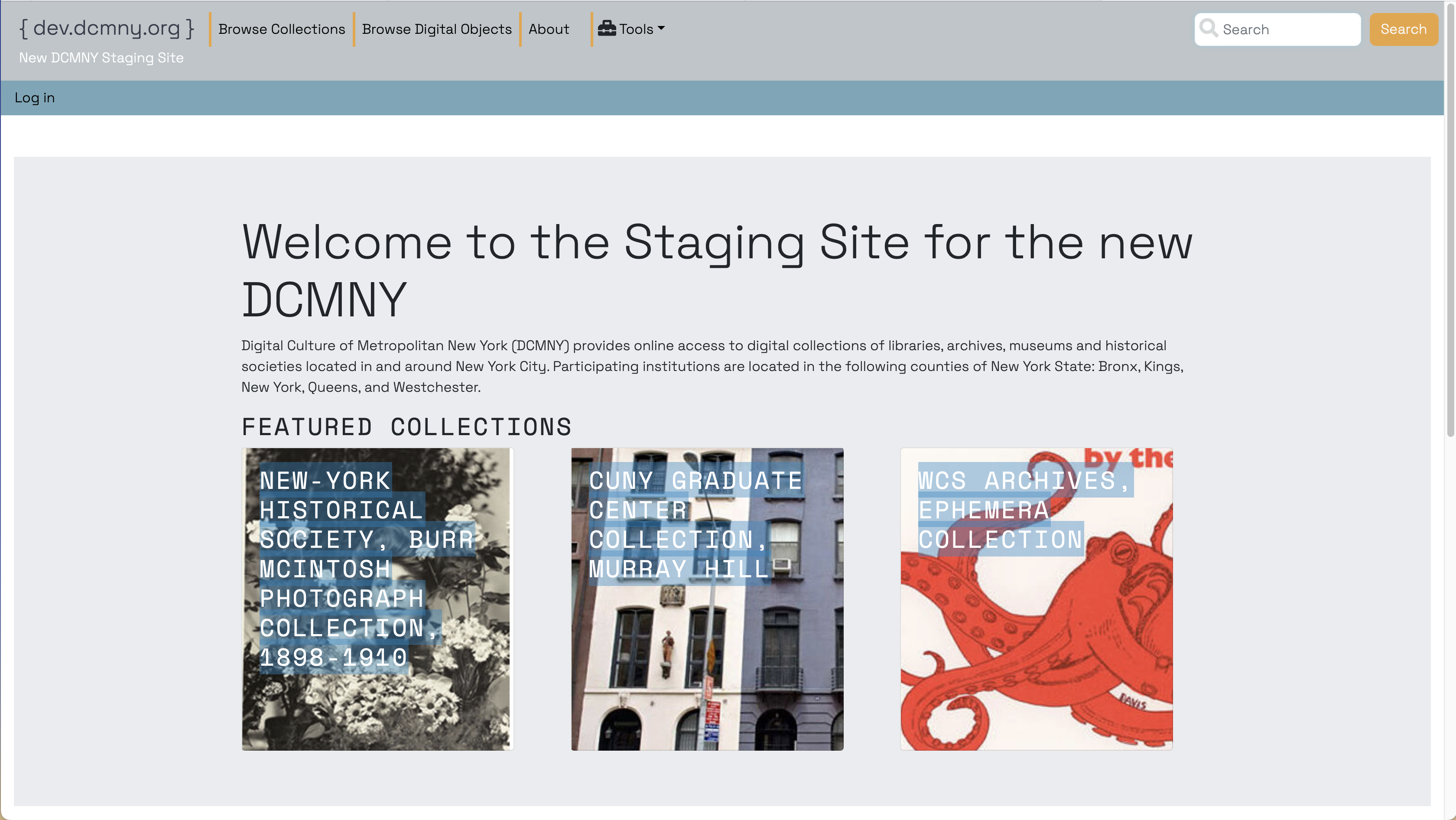
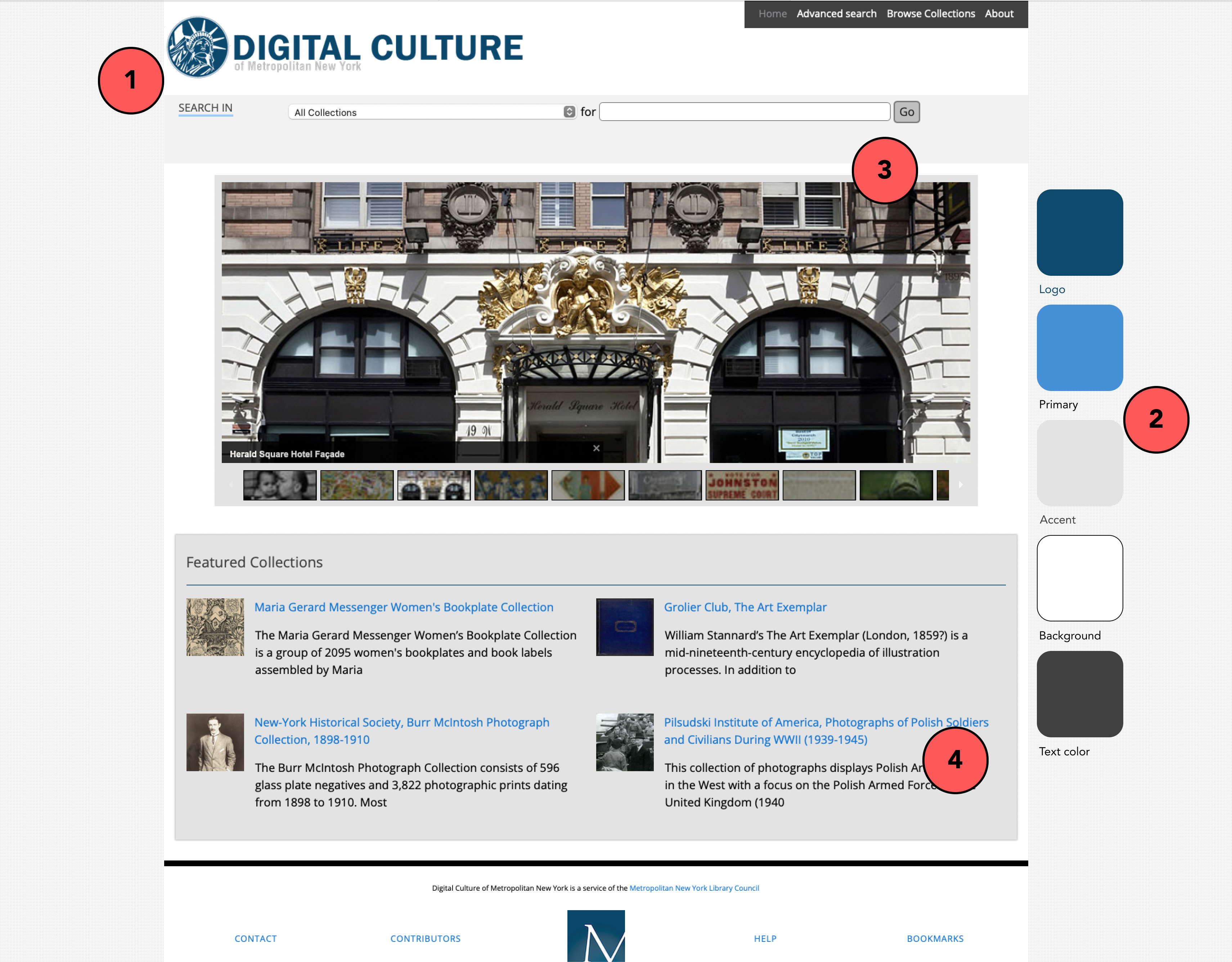
The staging site
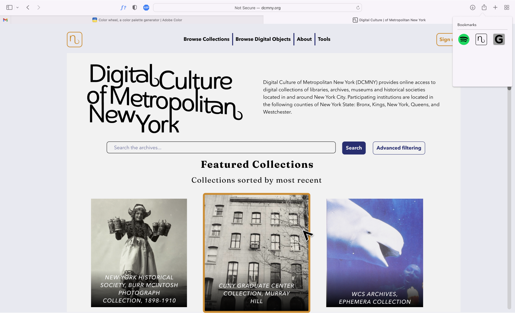
My proposed landing page
The library archive service I am working with needs a new brand identity.
This was requested with three main deliverables -
The existing logo - busy, boring, and hard to scale.
UI kit for the existing website. Notice the single font and color, with a lack of hierarchy and contrast of different uses.
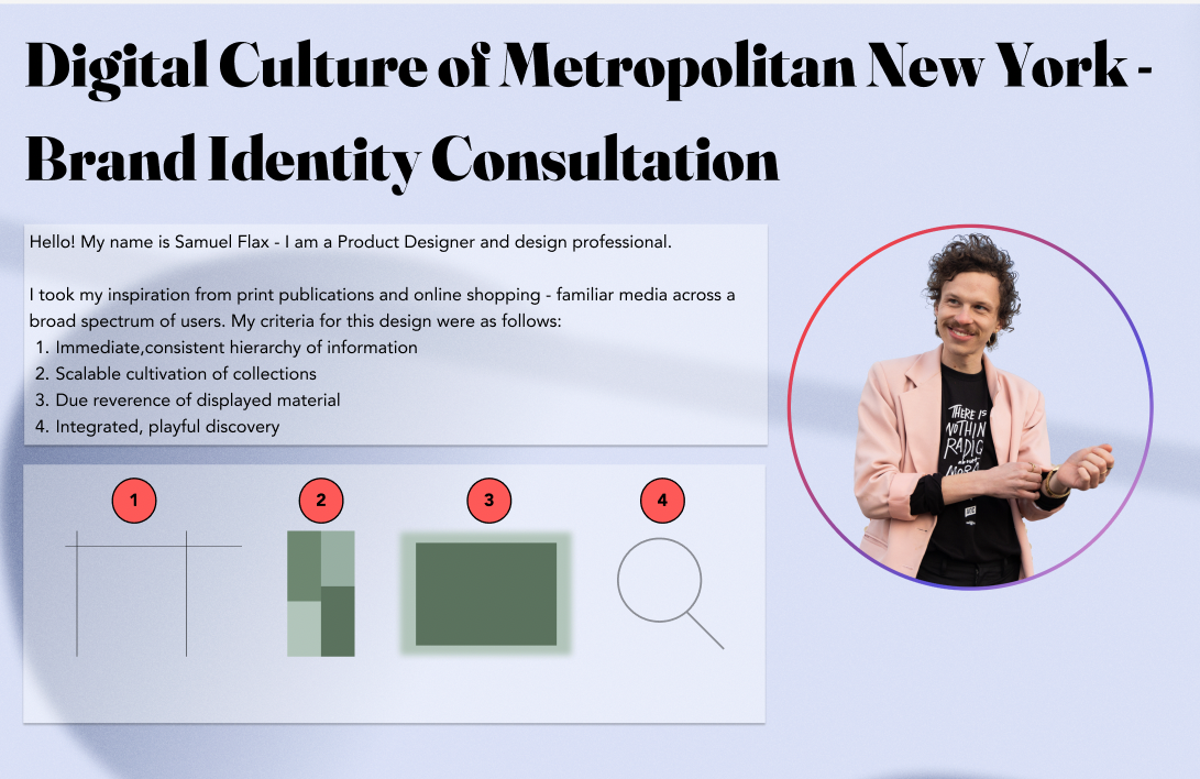
My most vaulable asset going into the project was a detailed workplan I created. The client had a strict deadline, and by detailing my steps and methodology I broke down the whole task into time-managed chunks.
My most profound insight was gained through guided critique. By finding faults with the current brand design, compiling and annotating these faults, and presenting my findings to the client, I was able to gain initial insight on the client's needs.
The start of my workplan - I was striving to keep the presentation engaging and annotated.
Annotated critique of the exiting site. I was able to discuss each shortcoming with the client and ascertain needs and wants.
Comparative analysis of digital archives
I conducted comparative analysis tests with my clients to ascertain their needs. Through comparing existing logos, I learned three things:
The client is looking for a logo divorced from trends, a monochromatic or colorless logo, and the logo should focus on the name or abbreviation (a word mark or letter mark.)
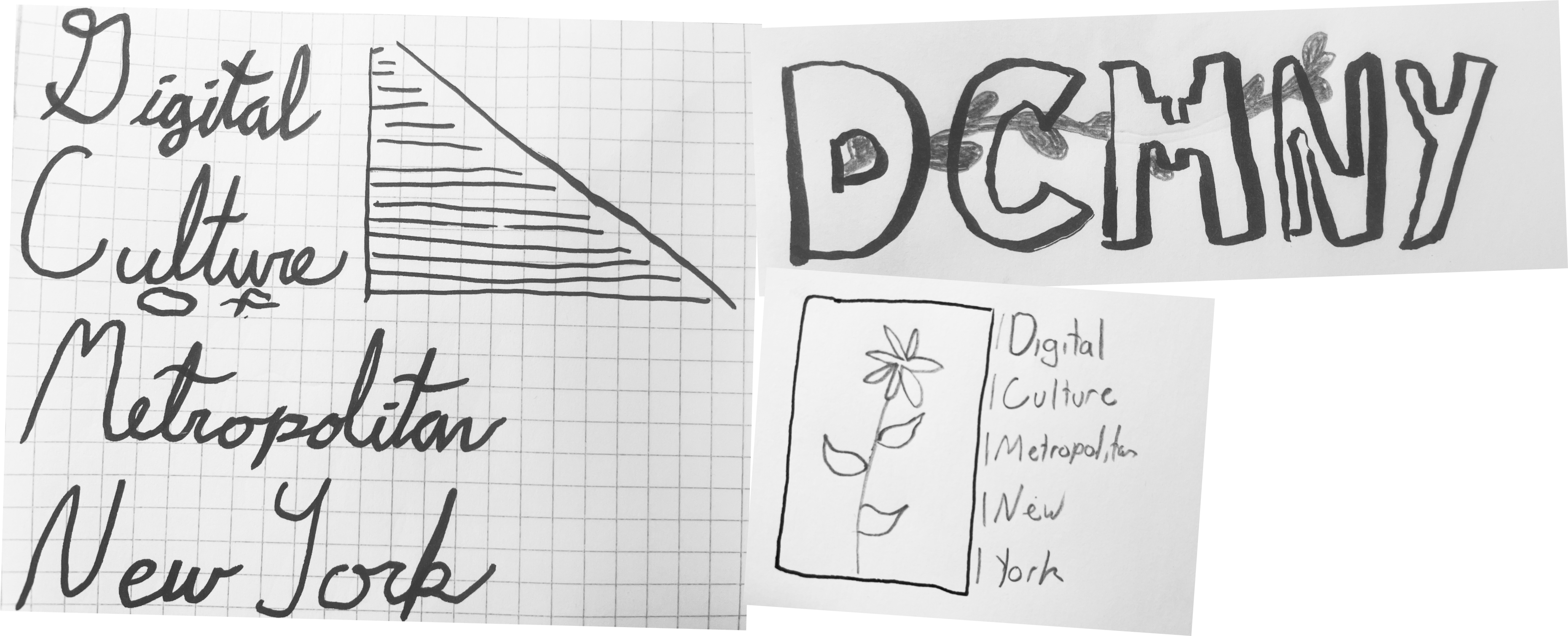
Preliminary logo sketches
Now that I had the client's needs, I could adress their wants. I interviewed the team to to pull visiusla inspiration. We decided on a visual focus to guide the project: a micro level view of New York City - people socializing on a stoop, or a lively but constrained community garden.
I created some sketches and began to develop them.
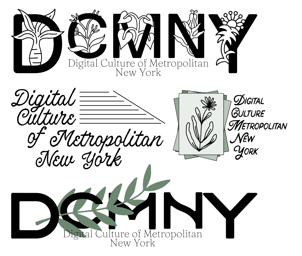
First round - incorporating ideas of 'overgrowth and community'
I created divergent ideas for the first round of logos. Sticking to the theme of community gardens, I used subtle floral motifs throughout to display growth and belonging.
I learned this feedback from meeting with the team - they were looking for the text to be tightly integrated, and love the structural aspect of the stairs.
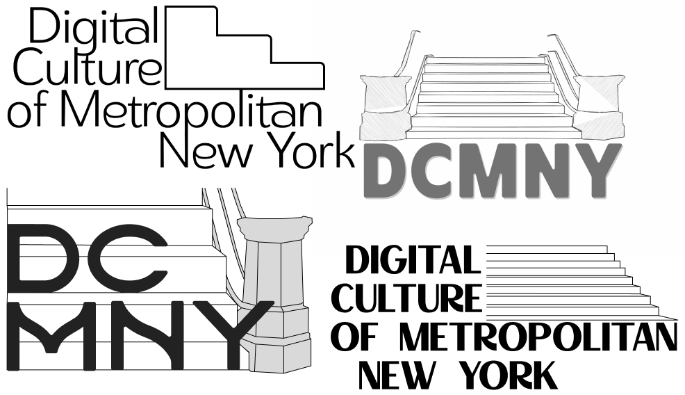
Second round - building on stairs
I created a second round of designs based on the client's feedback - focusing on structure and integration of the text. I met with the full team, and were able to gather feedback from a wider variety of opinions.
The team loved the lack of color, and the flowing, connected font of the word marks. They decided collectively that the stairs were too literal, and would rather aim for clarity of suggested steps.
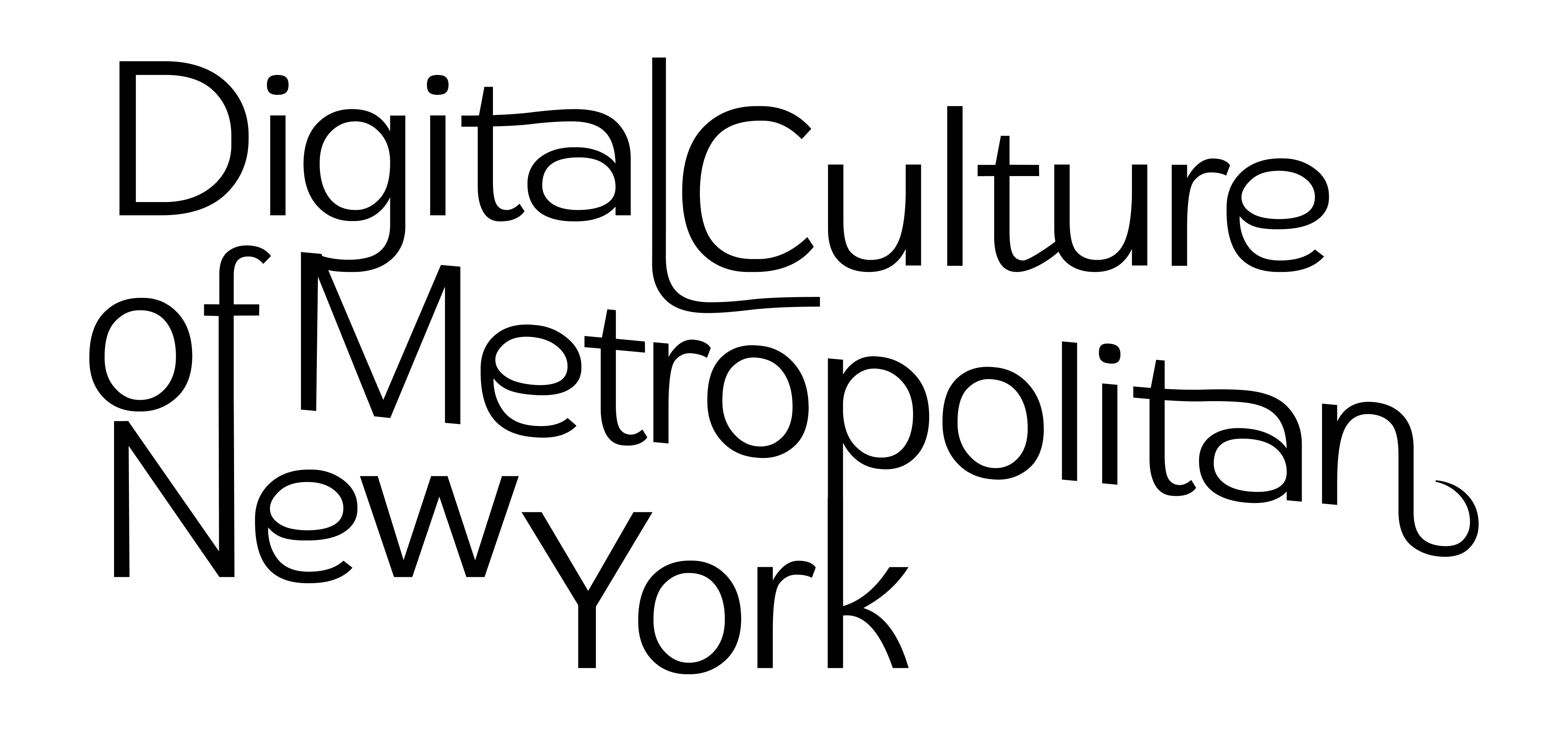
Final logo - refined and distinctive
The final design is a tight, intergrated, and flowing logo. The slope of the center indicates movement and dynamics. The strong vertical lines of the ligatures give a monumental feel, like a cluster of buildings.
Color competitive research - exploring different shades of blue
I again conducted comparative analysis with the client - this time to ascertain a color palette and hierarchy.
Using some more design-oriented sites above, I was able to establish three needs for the website:
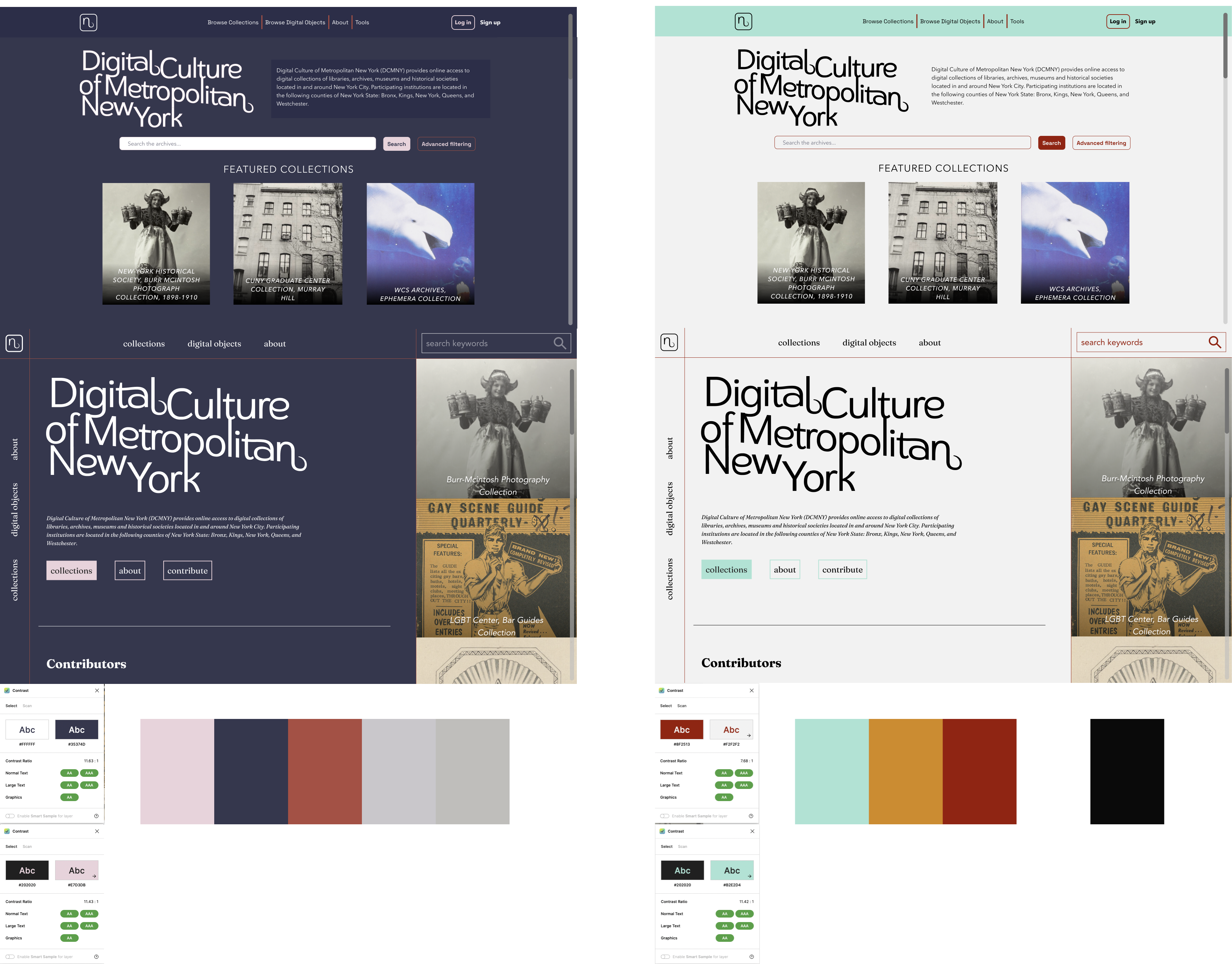
Applying two main palettes to website mockups
I chose two color palettes and applied them to my site mockups.
The first is a deep navy with rust highlights giving a dark, professional look with contrast.
The second is a light grey with a sea foam for structure and a subdued ochre for highlights.
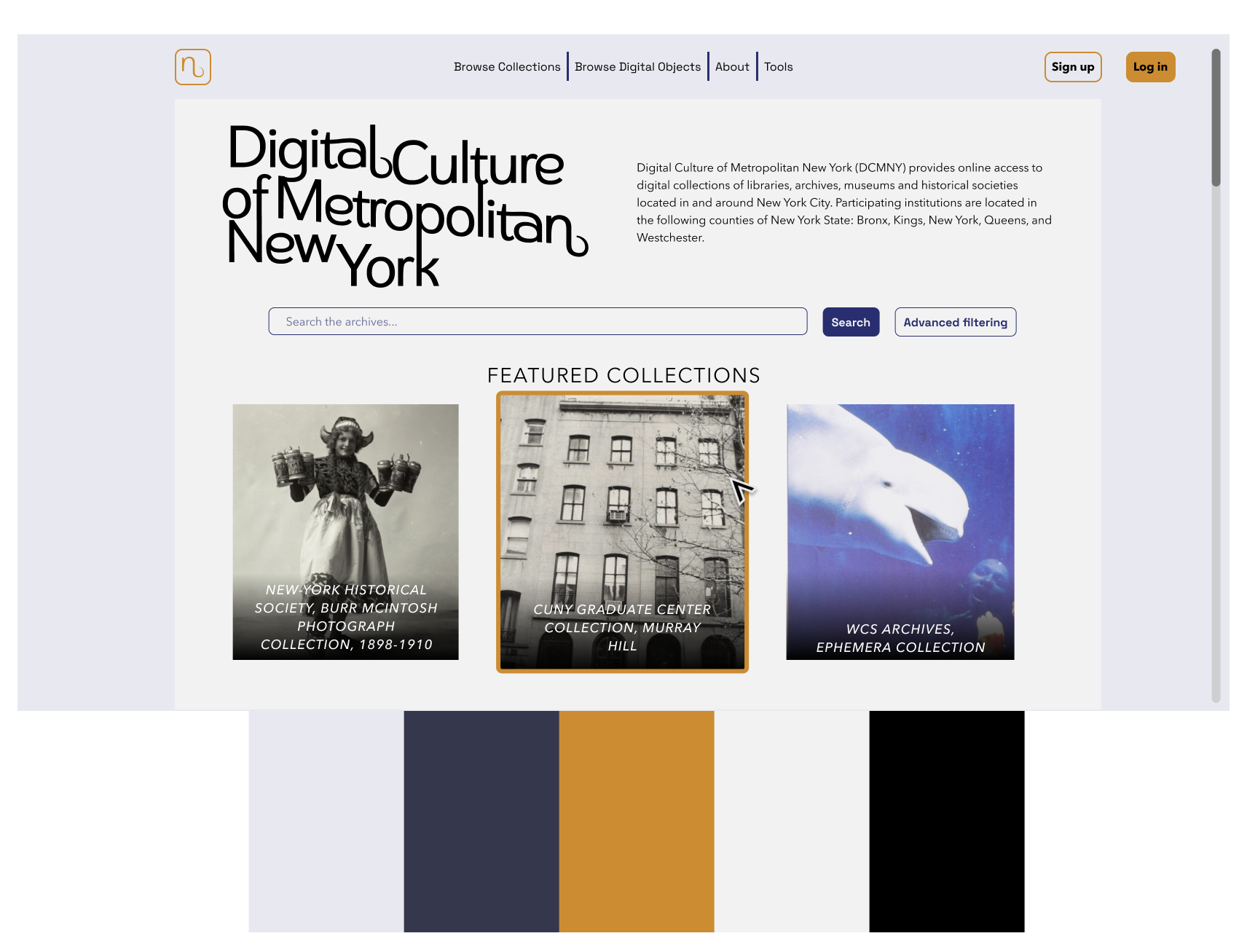
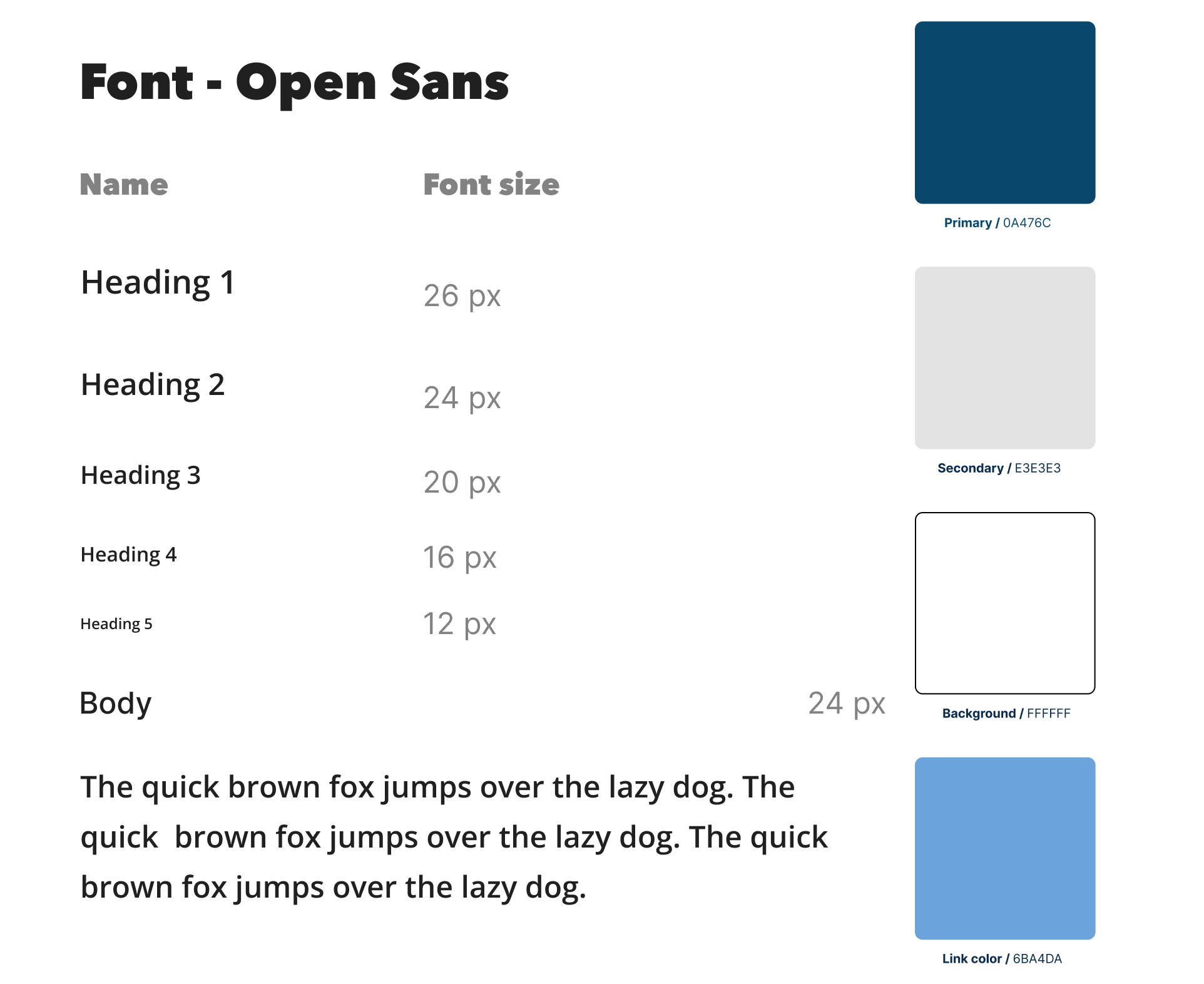
The final color design for the site.
I learned two things from my final palette:
The client knew from the onset what their primary color should be - I needed to listen instead of spending energy exploring other primary colors.
Subtlety is key when applying color to a professional site. There were lots of sites in my research I found beautiful, but in this context color hierarchy plays the biggest role.
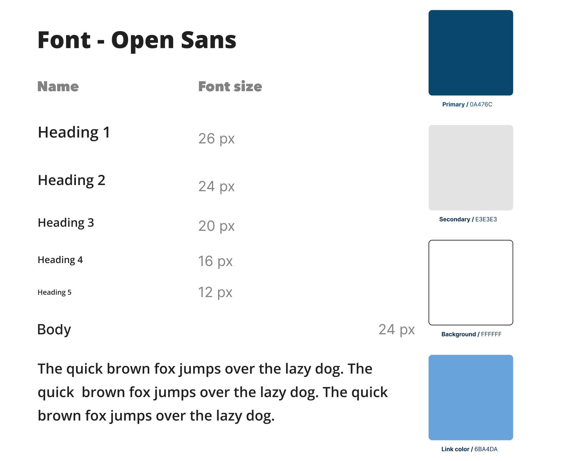
Current font family - a simple sans with no weight distinction.
The original site is a single font, with a single weight. A narrow variety of font size is the only use of hierarchy.
I wanted two things for the client: clear headings that were distinct from the body text, and an easy-to-understand herirachy for future development.
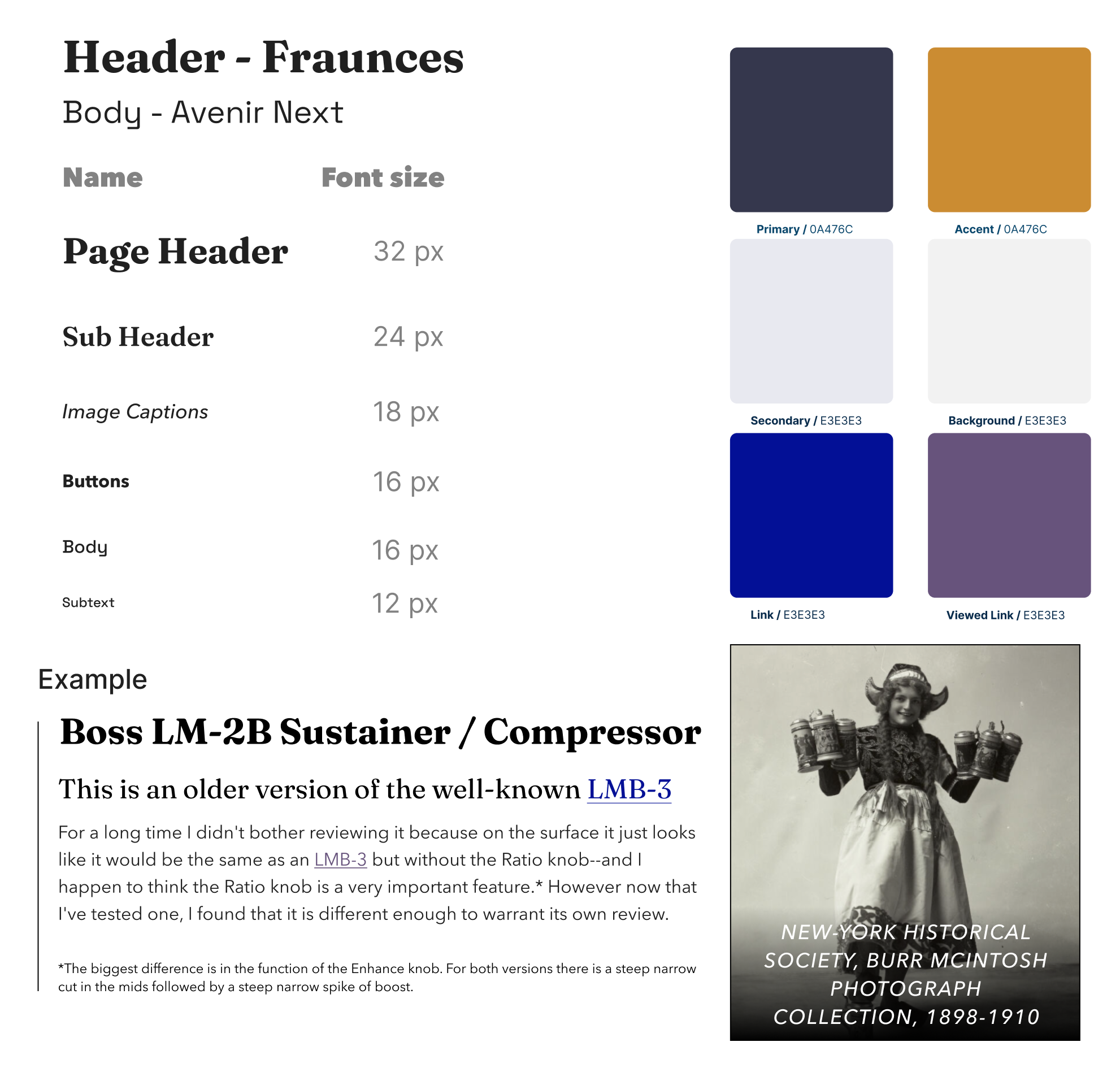
My font family - two font families with a clear descending herirachy of visual importance.
I created a UI kit with two fonts: Fraunces, a distinctive serif, and Avenir Next, a display-focused sans.
The header and subhead are seperated by size and weight. The body is distinctly lower on visual hierarchy, by the use of a medium weight, smaller size, and unadorned sans build.
I had two different groups of stakeholders for this contract: a group of three archivists who were my design liaison, and the whole organization as a collective.
I met with my design team every week, updating them with short slide decks. These compiled my thoughts, introduced new ideas, and allowed for easy collation of feedback on ideas from team members.
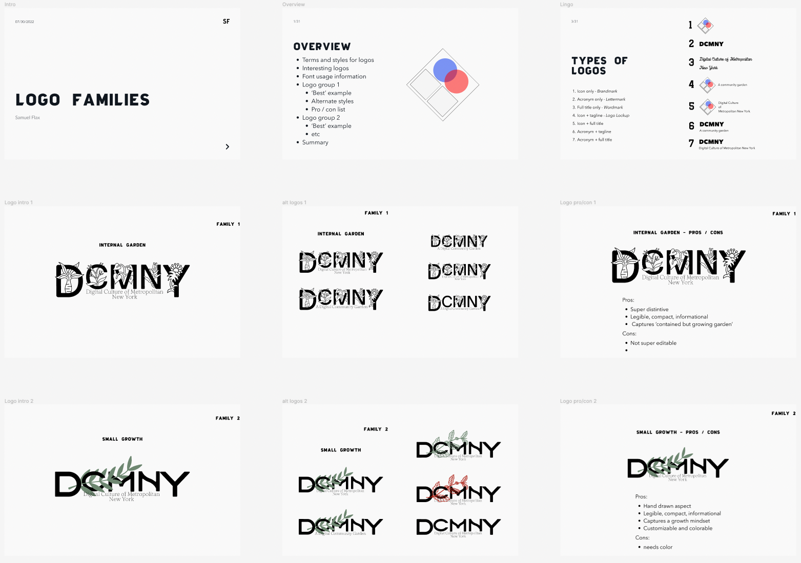
An example of my first slide deck - covering the initial ideations of the logo.
During the penultimate design state, our team had three separate logo designs to choose from. We decided to gather feedback from the entire staff to move forward.
I created a PDF that could be shared and read asynchronously by the entire team and shared it with them. Through feedback I was able to refine and deliver the final product.
A screenshot of my presentation. See the full PDF here.
I delivered my final product. I accomplished my three main goals:
Final mockup - incorporating the logo in different sizes and positions, all font hierarchies, and correct color usage.


