dandy
A queer art storefront looking to modernize its sales through clean UI and CMS indexing of store items
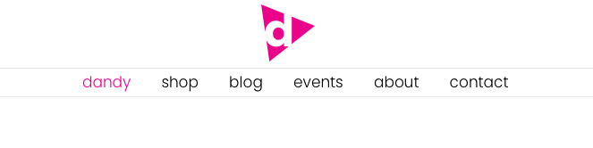
The header for my new site
Timeline
Winter 2022-23
Role
UX, UI, Wordpress development, logo design
Project Type
Online storefront for independent art, with a blog for features and an events calendar
Portfolio Focus
A close look at the design of the shop's item page for desktop, using user stories and eye patterns.
Project Outline
1. Problem
2. Logo Creation
3. User Stories - Desktop
4. User Stories - Mobile
The site was hosted on a modern platform, but had been kicked off the site.
The owner wanted to take the opportunity to rebrand the website, while also building headroom to grow his business.
- Rebrand the website to match current marketing aesthetics
- Build a storefront that can accept payments worldwide, and transfer all items and stock
- Organize the blog with all entires, and build a beatufil gallery view for displaying photos from events
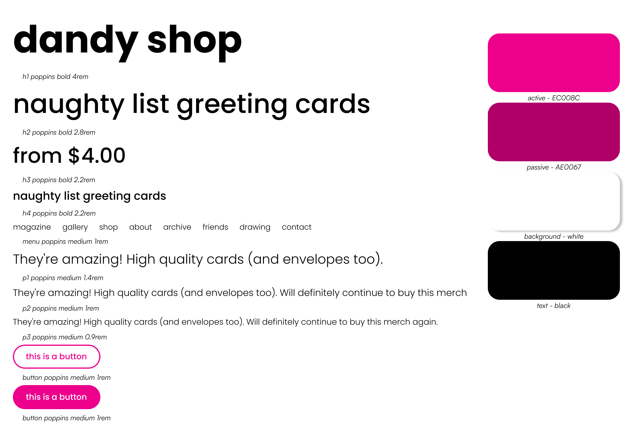
New UI kit. Emphasis on clean branding and tight typography
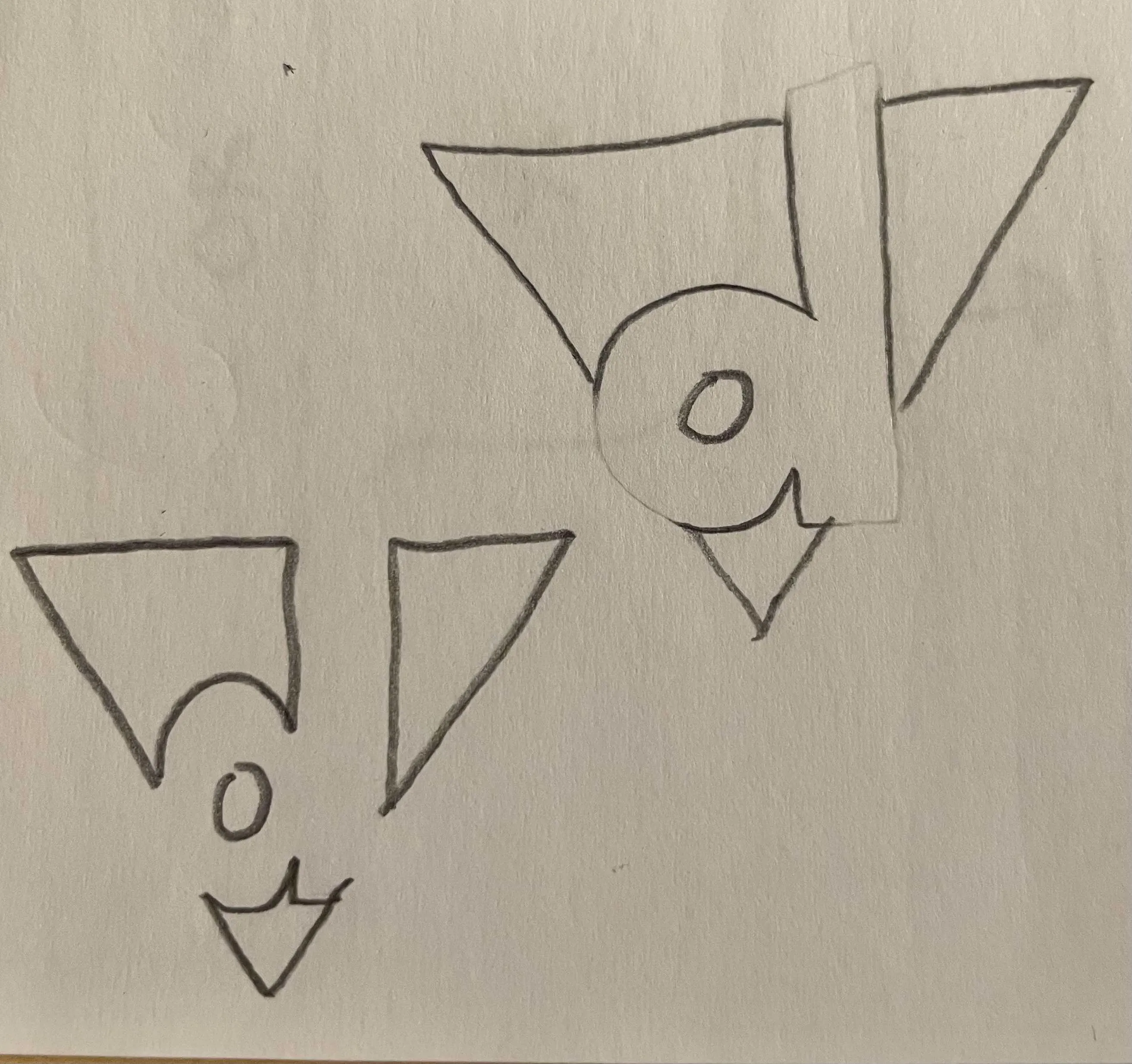
First sketches

The initial pass
The owner requested two defining features for the logo:
an upside down triangle to represent the historical signifier for 'homosexuality', and the CMYK color magenta for its playful and striking vibrancy.
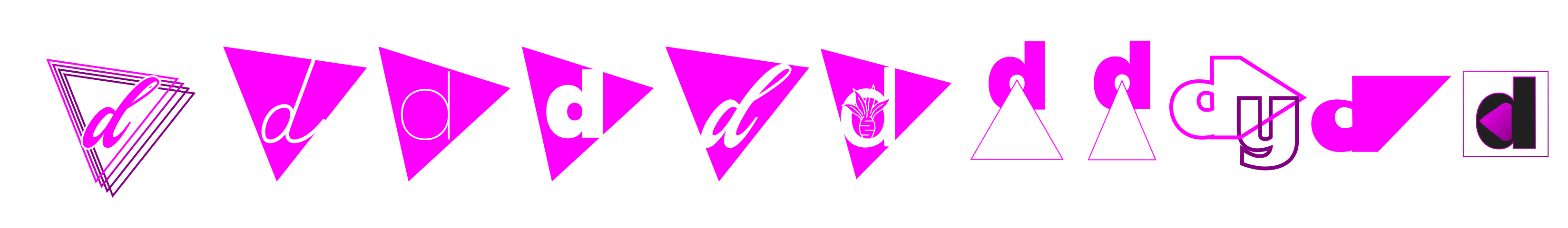
Ideas for logos
I created a lot of ideas, based around some key fonts used in the site. I decided to play with the form of the triangle, adding motion and movement to it. Since the site would be clean and symetrical I wanted there to be action from the logo.

Final logo
I created a lot of ideas, based around some key fonts used in the site. I decided to play with the form of the triangle, adding motion and movement to it. Since the site would be clean and symetrical I wanted there to be action from the logo.
I approached the item page first - this is a store most importantly, and the framing of the product needs to be perfect. I approached needs of the item page using a user story.
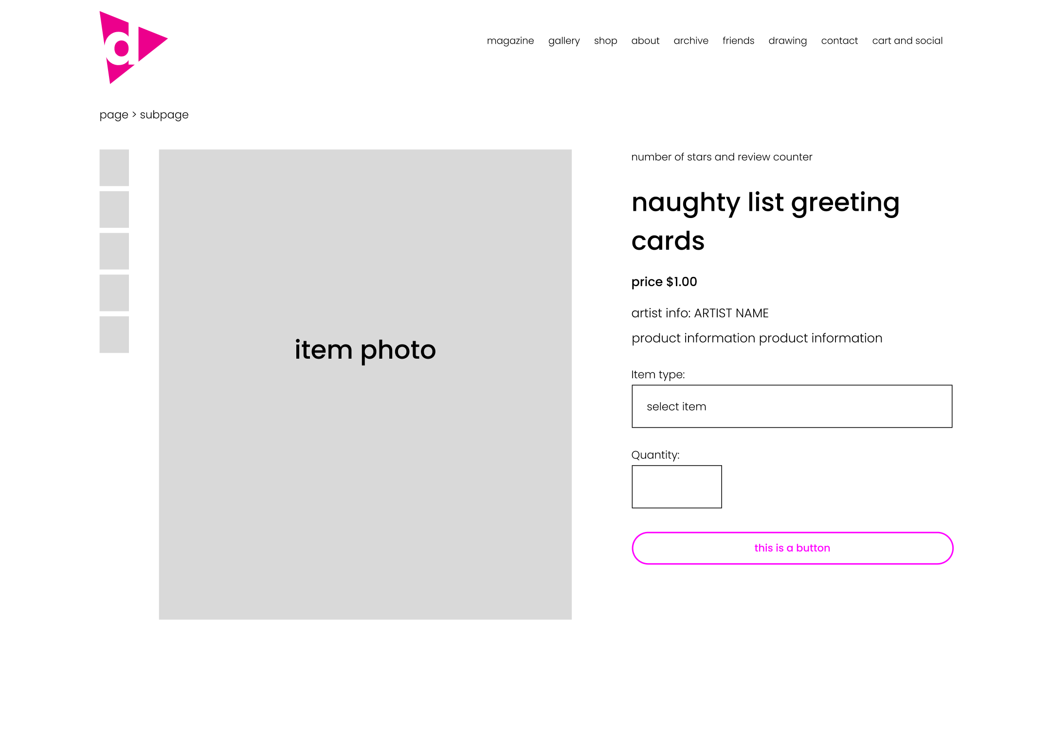
My original mockup for the page
I created a mockup based on market research of other shopping sites. I then approached my first user story to see what I could improve.

David wants a quick user interface
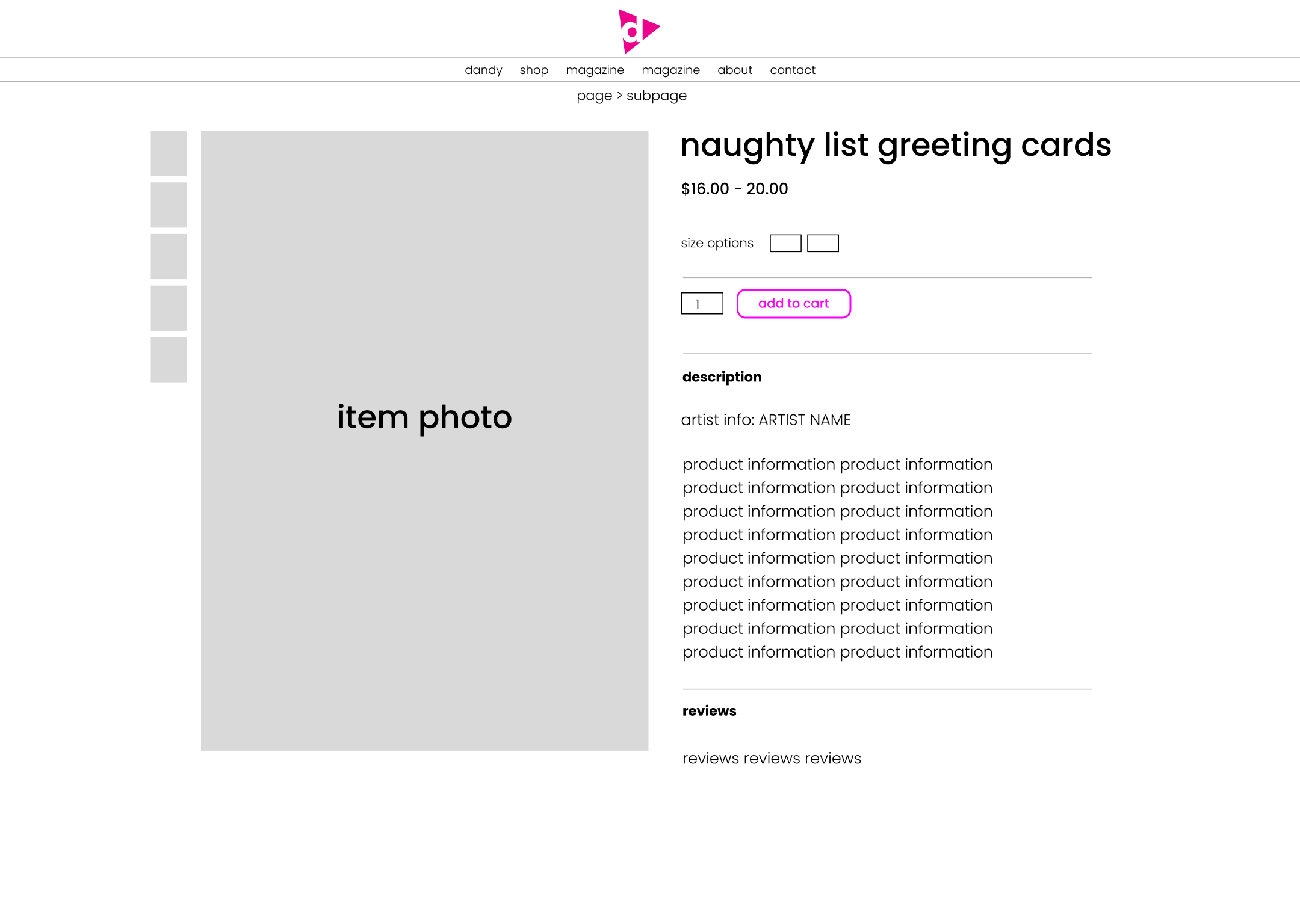
David wanted a site that streamlines the checkout process. I used a technique called F-Pattern Mapping to better accommodate the viewing pattern of the page - users naturally look at the photo first, then the title, then along the axis of the bottom hash of an 'F'. I put the size option and 'add to cart' button here for maximum visibility.
Second pass at the item page, focused on purchasing flow
David wanted a site that streamlines the checkout process. I used a technique called F-Pattern Mapping to better accommodate the viewing pattern of the page - users naturally look at the photo first, then the title, then along the axis of the bottom hash of an 'F'. I put the size option and 'add to cart' button here for maximum visibility.

Frances wants a quick user interface
Next, Frances has very different needs. He is looking at the site to browse and be inspired.
I addressed his needs by implementing a related items at the bottom - tying the page into the site as a whole.
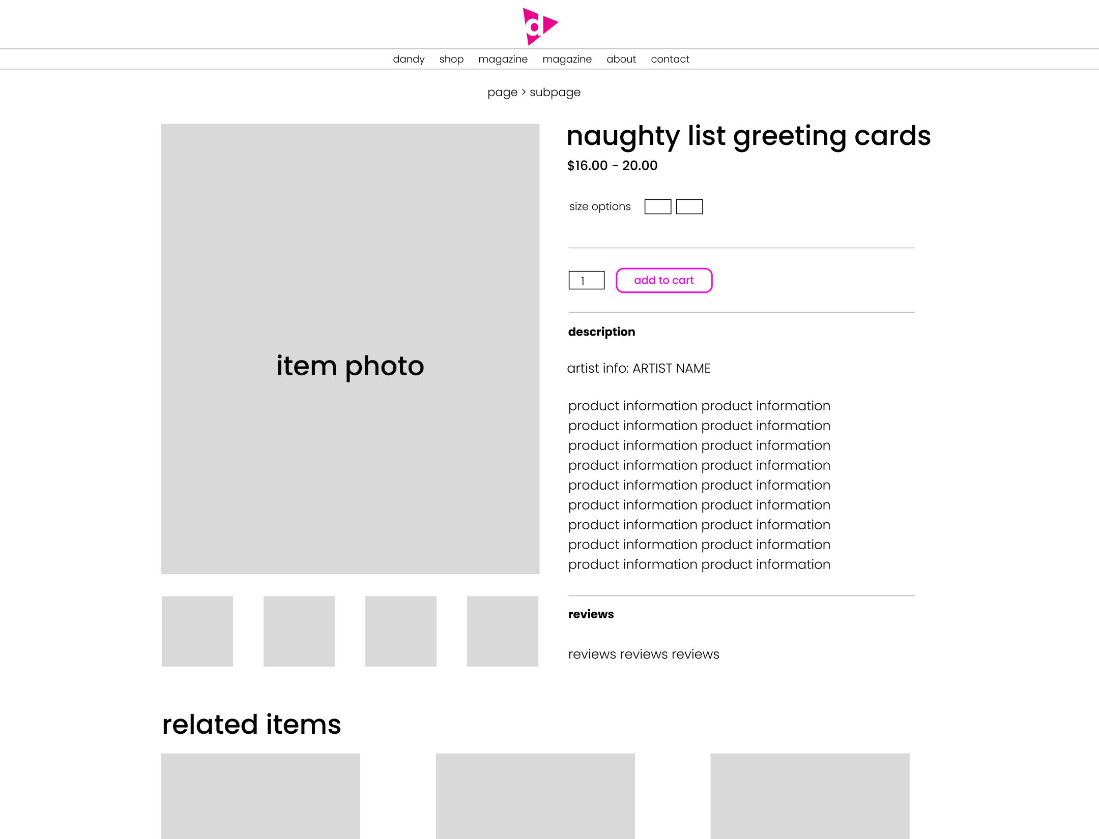
Related items added for site cohesion
Next, Frances has very different needs. He is looking at the site to browse and be inspired.
I addressed his needs by implementing a related items at the bottom - tying the page into the site as a whole.
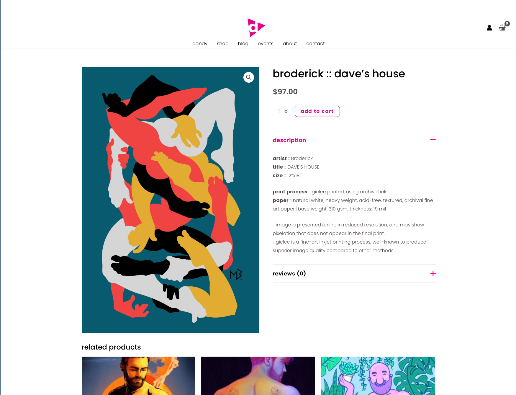
Final design for store page
My client noted that 80% of his sales came through mobile devices - we needed an excellent mobile presentation.
Using the mobile design principles outlined by Steven Hoober here, I started to create a vertical item layout that focused on center alignment, scrolling patterns, and adaptable layouts.
The result is a flexible and intuitive shop page that easily lays out all information needed.
The result is a flexible and intuitive shop page that easily lays out all information needed.
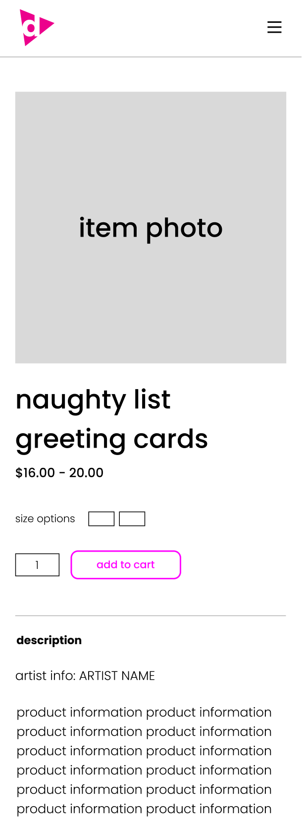
Mid fidelity mockup of the mobile item view


